
NO CODE DATA MANAGEMENT


Overview
TEAM: 2 people
ROLE: Product designer
TOOLS: Figma, Miro, Trello, Slack
As our world moves more and more to a digital age, data management is a rising topic and need for any business. Being able to manage and access data is crucial for any business whether it is a startup or a large company. Making data accessible for anyone in a company no matter their role can help businesses make the right decisions, work faster, and scale their business. This requires an easy-to-use data management platform that can be used without the knowledge of coding or data engineering.
DataNow is a no-code data all-in-one data management platform who’s goal it is to make data accessible for everyone. The company was created by founders Matthieu and Florent who met through a french startup program called Entrepreneur First and are located in Station F in Paris, which is the world’s largest start-up center.
The company is currently in their early stage. Even though they have only been developing the product for four months at the time of this project, they have already managed to sign up four clients. The company is now looking into developing the user interface and brand look of the platform. For this project our task is to design the data transformation flow.
SOLUTION


THE PROBLEM - DATA MANAGEMENT PLATFORMS ARE COMPLICATED TO UNDERSTAND
Data looks different for every user and can be complicated to overlook and clean to the essential part. We need to design a system that can be adapted to everyone’s needs no matter what their data is or which part they want to visualize. For this, the platform needs to be easy to use and the step-by-step process needs to be clear so that the user doesn’t get lost or frustrated.
RESEARCH PREPARATIONS
As we had no previous knowledge of data management at the beginning of the project we started out with a CSD Matrix to put down what we knew for a fact, what we assumed about the topic and what we were unsure about.
Our main certainty was that data management is essential for almost any business nowadays and therefore a growing issue. Our main doubt was the understanding of what exactly data is and how it needs to be handled.

COMPETITIVE ANALYSIS
The competitors' analysis was of great importance in our mission as we needed to map out how the process of data conversion overall works. We wanted to know how other platforms organize the flow, which steps are absolutely necessary, and which steps cause confusion for the user.
We learned that:
1.How the process of data conversion works
2.The need for no code data management is growing
3.Data management platforms can help start-ups to scale their business


RESEARCH RESULTS
For our primary research, we conducted 2 expert interviews (background in data analytics), 4 user interviews (2 current clients of DataNow) and we sent out a survey to the Station F platform that got 58 replies.

INTERVIEWS
User interviews with people who use a data management platform in their job helped us to understand better what the actual needs of the user are and what they would like to improve on their current platform.
“An all-in-one data management platform can be very useful for people who are not comfortable with coding data”
The main insights we found from our interviews were:
The current platforms are sometimes hard to navigate due to a lack of guidance
Errors are hard to find or correct and that leads to a waste of time
The lack of pre-visualization is causing confusion
Poor customization frustrates user because it is hard to get exactly what they need
EMPATHIZING WITH THE USER
We created an empathy map using FigJam, to understand the user better. On this map, we gathered all the key points we had from our interviews and survey results and organized them into categories.


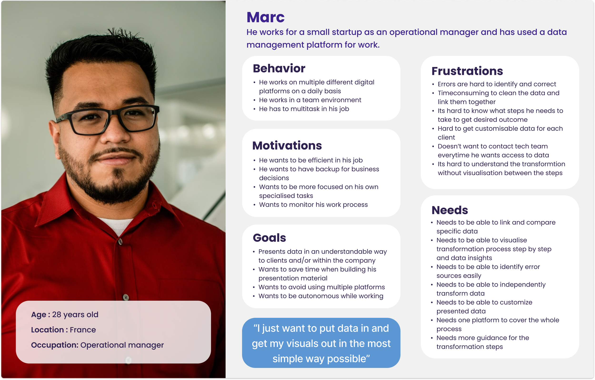
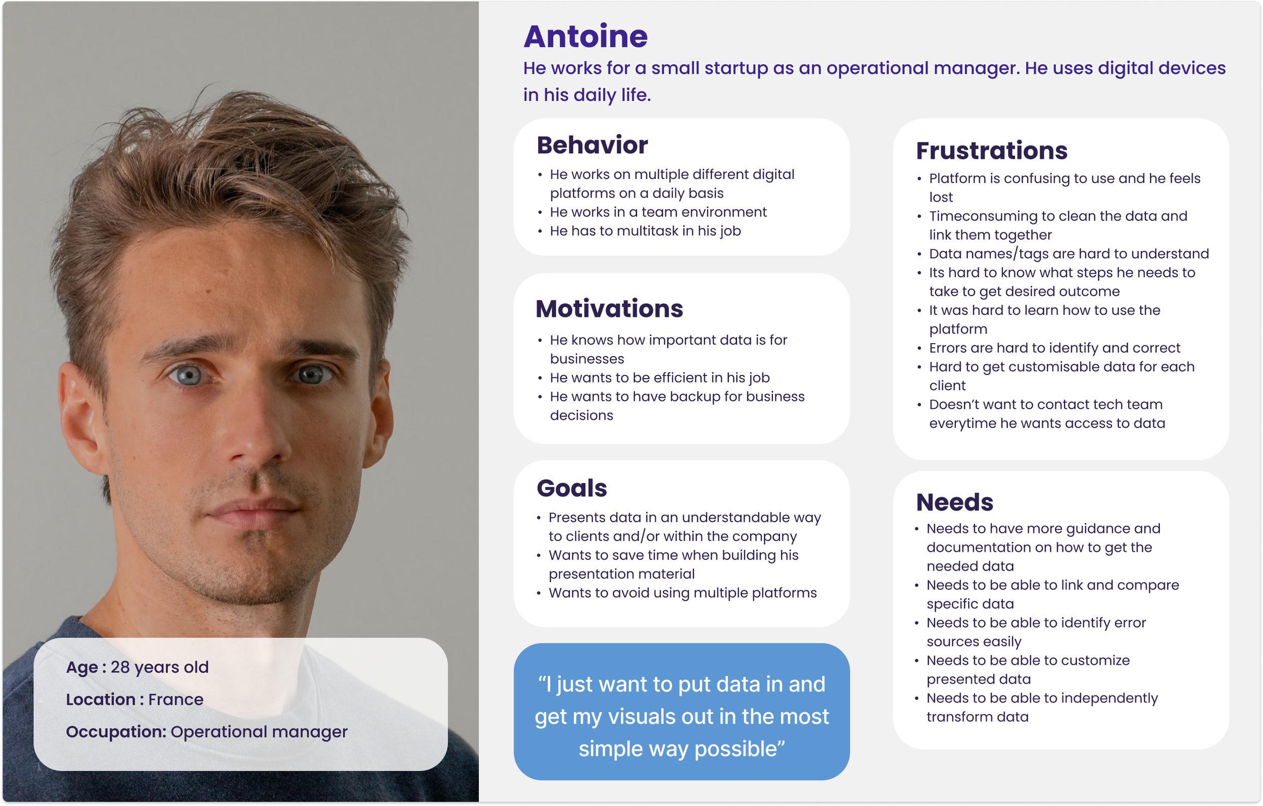
WHO IS OUR USER?
As DataNow's objective is that the platform can be used by everyone we had at first created two user personas, a primary, one who works in marketing and does not know much about data but needs it in their work, and a secondary, who is a specialist in data management. However, we soon realized that we cannot solve everyone's problems at once. After testing our first prototype we had to circle back and redefine our target user. We landed on a middle ground of
someone who is familiar with data management platforms but who is not an expert.

USER JOURNEY
We created a user journey to identify the main pain points of our user.

PROBLEM STATEMENT
After mapping out our target user and identifying their journey we defined the problem statement as follows:
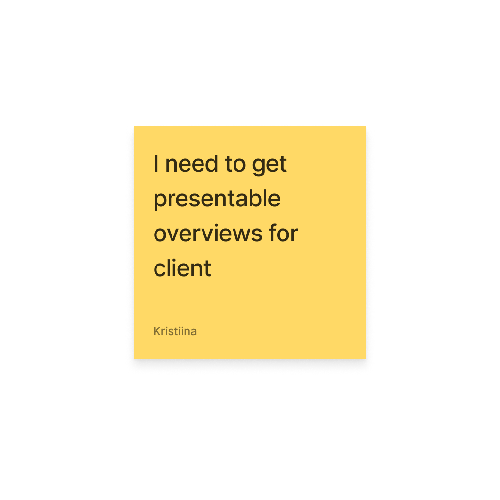
The professionals who work for a small startup needs better descriptive and visual guidance on their data management platform because they feel lost and get easily stuck without any help.
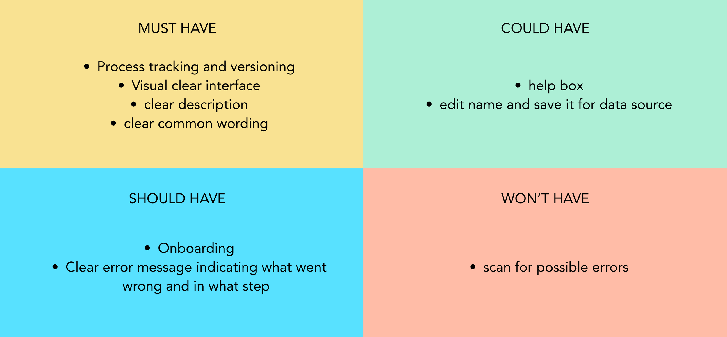
FEATURE PRIORIZATION
We applied the MOSCOW method to prioritize the features we would focus on. By doing so we needed to keep our time frame in mind and think about what feature we could realistically build during that period. We managed to add some of the ideas from the "should have" and "could have" sections that were not requiring too much time, such as the error messages and renaming options. We did not have time to create the onboarding screens.
USER FLOW
With the help of a user flow we could visualize and understand the steps better the user needs to take to complete the task of data conversion.

FIRST PROTOTYPE
We used the Crazy 8 method to come up with fast and spontaneous ideas on how to solve our problem. From these ideas we created our first version of the prototype in a low-fidelity version.
We wanted to focus on consistency to avoid confusion. We decided on a one-screen workspace that has action panels on both sides, this way the user does not need to switch between pages.
We created dropdown lists to add to the visualization aspect, this way the user can see all its options for a certain action as well as an instant result added to the workspace.

MID-FIDELITY PROTOTYPE


TESTING
Because one of our main goals was accessibility and to create an easy-to-use UI, we conducted testing throughout our design process and iteration.


The interrogation mark button to change column properties was unclear so we changed it to a dropdown where the user can directly see all the options.
We noticed that users were easily overseeing the plus button to start the conversion process and adding data so we added a guidance popup.
When saving changes the guide popup note was originally on the top of the page but was hard to notice and moved close to the "save table" button.

STYLING
After having our prototype in a functioning state we started thinking about styling.
The client had expressed the wish to stick with the original color blue and purple which we accompanied with a bright yellow for an accent color.
We also chose to repeat the gradient shade from the original logo in the top panel of the platform to add an additional brand element.
For the font we chose an easy-to-read sans-serif font “Kantumruy” to keep the platform as clean and simple as possible.
For the mood board, we wanted to focus on a calm and organized layout to communicate friendliness and clarity. It reflects everyday things that are easy to use and familiar to most people, different ways of organizations, and a warm and homely atmosphere. In the mids of lots of things it’s an organized chaos, just like data can be, but in a less scray way.


COMPETITIVE ADVANTAGE
Competitors on
the market
Multiple screens
Too technical wording
Lack of visual guidance
Lack of pre-visualization
Our suggestion
Fixed workspace
Only one screen
Simple side tool panels
Pre-visualization
Guidance and info messages
Guided step-by-step process
The Final Prototype
LAST WORDS
We faced lots of struggles during this project as the process was hard to understand and everybody's needs for the platform vary a lot depending on the niche of work they are doing. We think that we provided the best possible first version of the platform that is ready to be launched.
Going further we would like to keep testing and iterating to develop the usability and fix possible bugs.
As the next steps, we think that the platform could provide a "light mode" that would be easier and more straightforward to use and an "expert mode" for more advanced users where customization is possible.
Templates with pre-visualization could further simplify the process and save time for the user.