
App Redesign

Fashion Reseller

Overview
TEAM: Individual project
ROLE: UI Designer
TOOLS: Figma, Miro
Fashion e-commerce platforms carry loads of product and a huge amount of categories. Therefore, the site map needs to be able to navigate into many directions while still keeping the customer from becoming overwhelmed or feeling lost.
I solved this issue by cleaning up the UI to a neutral background that could easily adapt to trends and lets images speak for themselves. I also updated the styling to a more modern look and reorganised the site map and interaction design for an easier flow.
For this project I chose the three screens that in my opinion needed the most refreshing and are contributing strongly to the users experience on the platform, buying decisions, and whether or not a customer returns as a user.

SOLUTION
PROBLEM - THE OLD DESIGN IS TOO CROWDED AND HARD TO NAVIGATE
Looking at the Zalando app I could instantly feel the overwhelming amount of products and directions I could take as a user. Scrolling the homepage feels endless and its easy to loose track where on the site I was moving. All screens were different sizes and colours and it was hard to understand the correlation between colours and categories. On top of this the UI and style choices seem outdated which could easily impact my trust towards the platform as a user.
My goal is to reorganise the flow and update the facelift the UI to a more modern and compelling look. After all Zalando is a global leader on the market and should reflect that on its platform as well.
I started by recreating the frames that the app currently displays to better understand the components and structure that it is built of. During this process, I could better analyze and brainstorm what aspects made sense to me and which didn't and come up with ideas of how to rearrange the parts in a better way.
RECREATION OF FRAMES


CATEGORY LAYOUT IS NOT MEANINGFUL TO USER
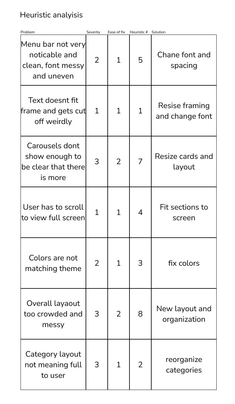
I conducted a heuristic analysis to identify specific problems where there would be room for improvement.
The points that I wanted to address were the following:
Because of the high amount of content, I mentioned earlier the home page is one almost endless scroll featuring different campaigns, promotions, and specifically curated content. These were showcased in different sizes of screens that sometimes were larger than one phone display and so hide part of the campaign text, and showing fashion photos on top of colorful screens. This created a feeling of overcrowded and messy organization, and often background colors were not matching the campaign or topic, ie. orange for wedding shoes, that might or not have been for a wedding campaign?
The specifically curated section based on the users previous activity or liked items was all the way on the bottom that is hard to believe any user would scroll that far, especially without any given incentive to even indicate that there are more pages coming.
Lastly, the organization and flow of the app was extremely illogical where ie. the gender selection was found on the account page instead right next to the search or other category selection.
THE BEST APPS IN FASHION FOCUS ON A CLEAN AND NEUTRAL LAYOUT


Asos
Asos is Zalando’s largest direct competitor. The main aspect that I paid instantly attention to was that the app is built completely on a simple white background and even the icons are simple gray and black. All the color comes from the images and items that are sold on the app. I think this is done to keep the frames organized and guide the user’s eye to the products without any unnecessary distractions.


Zara
Zaras app was interesting to analyze as they had just recently updated their UI and the new layout was very satisfying to use. I especially appreciated the clean layout with clickable links directly on text and any boxes or button styling was completely left away. Also, the full screen campaign photos gives a high-class and powerful image and the navigation bar on the side lets the user stay aware of where they move on the page.


TheRealReal
As a third competitor, I looked at The Real Real app which is a vintage resell app that has been in the game for a long time. I wanted to look at this site because I think that they face an interesting challenge where they don’t have agency over the images displayed on the app because the users take the photos themself and upload them. Images create a huge impact on an app’s overall look and we can see again that this problem is solved by a simple clean white background and very little color even on campaigns.
As I started planning my design I wanted my mood board to reflect exactly what I had learned from the competitors’ analysis.
The layout had to be clean and organized to avoid overcrowding. Lots of padding around images give a feeling of breath and lets the eye look at each image more carefully.
The brand color orange is low-key but visible to keep the sense of brand identity but to keep the main focus on the items.
MOODBOARD

STYLE GUIDE
Color choices:
For the style guide, I chose to stick with the site's existing brand colors but eliminated all additional colors that in my opinion just caused a distraction to the viewer. I wanted to keep the platform calm and organized through a white background and plain black and gray tones. Orange will remain the brand color that will show in the logo and as a highlight color, but that will not take a large role on the page to avoid clashing with other colors of the items, and this way I will manage to keep the site adaptable for future product collections without having to worry about changes in trends and colors.
Cards and frames:
I also resized the cards into simply two sizes "small" and "large" which will keep repeating throughout the page to emphasize uniformity and the feeling of organization.
Typography:
For the font, I changed the rather old-fashioned Helvetica for a more modern Nunito Sans but kept the serif font Tiempos for the subheaders and paragraphs to avoid too much change at once.


REORGANISING THE USER FLOW
BEFORE & AFTER - HOME SCREEN

I changed the homepage from a rather difficult overview to a more clearly structured scroll where each section is exactly the size of a device screen contrary to before when the user had to scroll back and forth to be able to see the content of one section.
I also added a progress bar to the right side of the screen to help the user navigate with more ease as the screen is very long.
The different campaigns now display a fullscreen image without any need for additional color blocks.
BEFORE & AFTER - FAVORITES SCREEN

The changes to the favorites page included also changes in the user flow. I found that the page navigation was surprisingly confusing and unexpected, for example finding the newly added second-hand section to sell old items in the favorites section. I moved this section to the "account" as I think that this is where consumers would expect it to be. In terms of UI and aesthetics, I increased the size of the latest added items to emphasize visibility which I think is also a better business decision as it works as a hook to encourage and remind the consumer of the items they like and possibly want to purchase. The new favorites page is clean and organized with a stronger emphasis on the user's latest likes and looks.
BEFORE & AFTER - ACCOUNT SCREEN

The account page went through changes in structure and flow, as well as visual aspects. The old page was extremely unpleasant visually as it was illogically organized and almost looked like an unfinished Mid-Fi.
I reorganized the categories sections that were more logically related to each other and cleaned the page off all unnecessary visual distractions leaving the page clean and easy to the eye.